SELECTED WORK
Built with intention.
A curated set of client and self initiated projects for therapy and health providers, with additional work for other small businesses, all designed with clarity and intention from start to finish.


A closer look at selected projects and the thinking behind them.
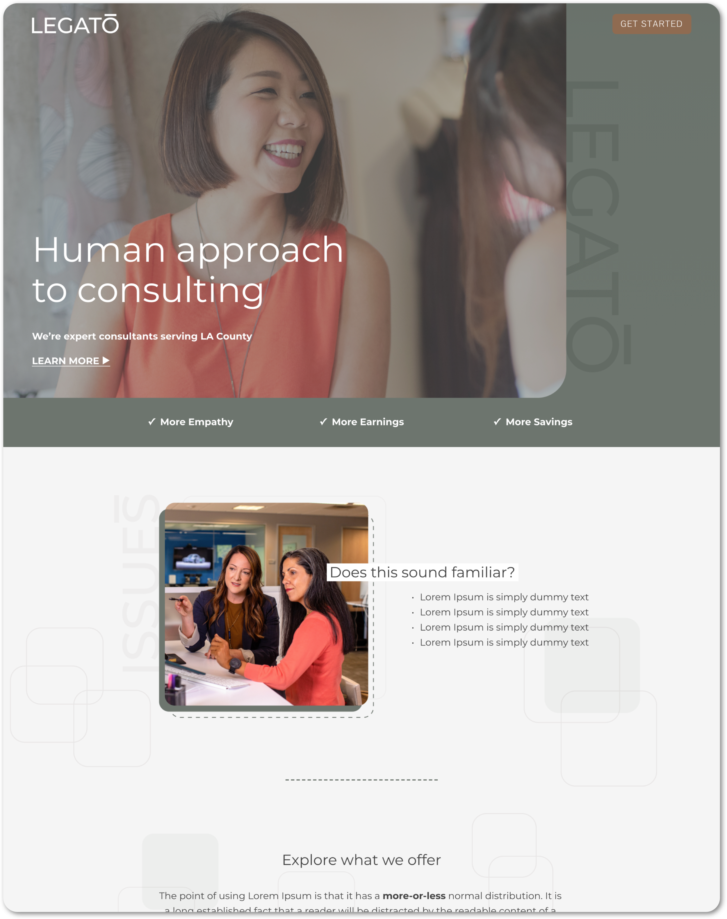
Psychotherapy practice
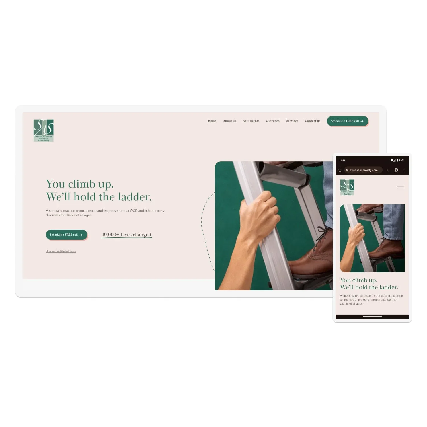
Stress & Anxiety Services
About the project:
Stress & Anxiety Services of New Jersey is an independent psychotherapy practice based in New Jersey. I have been working with this client since 2021, beginning with a full migration of their old WordPress website to a more modern and sleek design on Squarespace. At that stage, the client provided very specific instructions, and my role was to execute their vision and ensure the migration was seamless.
Website redesign project:
In August 2023, the client returned with a request to redesign several key pages including the Homepage, About Us, New Clients, On-Demand CE Offerings, Outreach, and Contact Us. Unlike the original migration, this redesign gave me almost full creative control, with only a few constraints such as the hero image on the homepage.
The updated version reflects a much more cohesive and thoughtful design. The new layouts improve readability, navigation, and overall flow while presenting the practice in a more professional and approachable way. Before-and-after screenshots highlight the transformation, showing a clear step forward in both style and usability.
Key improvements:
Migration from WordPress to Squarespace for a more manageable, modern platform
Initial build executed to client’s exact specifications and vision
2023 redesign with greater creative freedom, resulting in a cohesive and professional look
Enhanced readability and navigation for core pages including Homepage, About Us, and New Clients
Before-and-after comparison demonstrates the evolution and improved design approach
Client feedback:
“ He translated our vague, non-technical ideas into a functional, eye-catching website. We couldn’t have asked for a more responsive, hardworking, and talented designer.

Result:
A clean, modern, and user-friendly website that better communicates the professionalism and mission of Stress & Anxiety Services of New Jersey. The redesign not only elevated the site’s look and usability, but also reflected the client’s ongoing trust in my work, having partnered with me since 2021.
Psychotherapy practice
Stress & Anxiety Services
About the client:
Stress & Anxiety Services of New Jersey is an independent psychotherapy practice with a multi-therapist clinical team.
Social Media & Content Strategist:
I managed their social media presence end-to-end, developing a thoughtful content strategy and creating short-form videos and visual posts tailored specifically for mental health audiences. All content was designed to remain professional, approachable, and appropriate for sensitive topics.
This included strategy, content creation, ongoing optimization, and performance tracking across multiple platforms.
Key improvements:
Increased impressions by 137% (Facebook), 186% (LinkedIn), and 385% (YouTube) through platform-specific content strategy
Grew website traffic significantly, with +389% page views and +779% visits driven by integrated social and content efforts
Launched and scaled Instagram and TikTok presence with consistent short-form video content
One short-form video exceeded 118,000 views, expanding reach beyond the existing audience
Client feedback:
“ Alan delivered creative social media videos punctually and effectively. He is professional, courteous, and genuinely invested in our success, always accessible and taking the time to ensure thorough communication.


Mental health consulting
Germane & Wise

About the client:
Germane & Wise provides integrated behavioral health and collaborative mental health care by embedding a team of specialists directly into medical practices.
Homepage Redesign & Brand Refresh:
Modernized the homepage for a healthcare-focused B2B audience and refreshed the brand with an updated logo and color palette.
The redesign followed a clarity-focused messaging framework, restructuring content to clearly communicate the client’s value propositions, address audience pain points, and guide visitors toward engagement. Messaging was clarified, clutter reduced, and visuals updated to establish credibility and trust.
The project was built in Squarespace 7.1 with responsive layouts to ensure a professional, seamless experience across devices.
Key improvements:
Clear headline + tailored messaging for healthcare providers, managers, and behaviorists
Early social proof with testimonials
Improved readability, hierarchy, and brand cohesion
Updated logo and color palette for a modern, professional look
Client feedback:
“ He translated our vague ideas into clear solutions and consistently found ways to make things work. We will continue to work with him.

Result:
A professional, trust-building homepage and refreshed brand identity that strengthen first impressions and communicate value clearly.
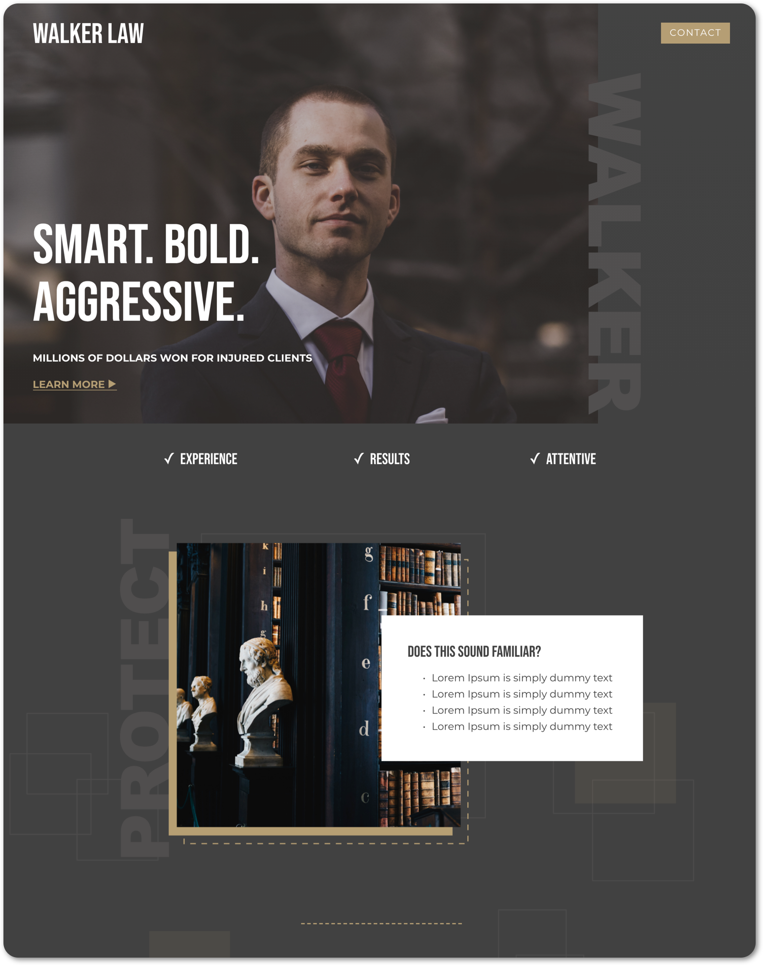
Tailored designs | shared structure
Same custom Squarespace framework, adapted for a law firm and counseling services

Private practice therapy
Sarah Wells, LCSW
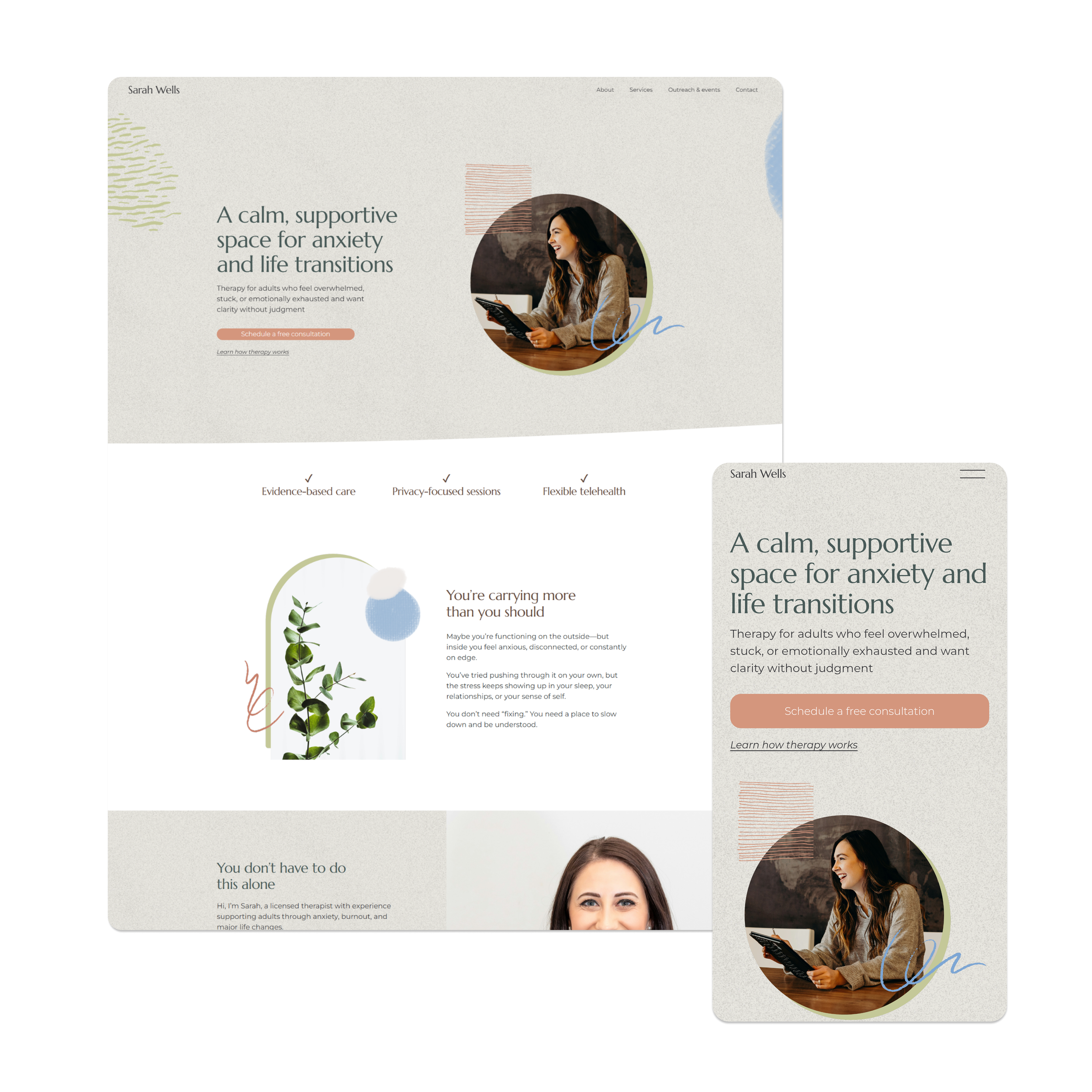
About the project:
This project is a concept created to demonstrate my ability to design calm, clarity focused websites for mental health professionals using established best practices.
The website was designed for adults experiencing anxiety, burnout, and life transitions who may feel overwhelmed or emotionally exhausted and are seeking support without judgment.
Homepage design:
Designed and built a homepage that creates a calm and supportive first impression while clearly guiding visitors from their challenges toward a clear next step. The hero section emphasizes emotional safety and clarity with a gentle call to action.
The messaging reflects common client experiences while positioning the therapist as a supportive guide and therapy as a clear, approachable process.
The homepage follows a clarity first structure with a problem and solution narrative, trust signals, a therapist introduction, a simple explanation of what to expect, and a privacy focused call to action.
Key improvements:
Calm and welcoming hero section with clear calls to action
Problem and solution copy aligned with emotional overwhelm
Messaging that guides visitors toward a clear next step
Trust signals highlighting evidence based care, privacy, and telehealth
Clear explanation of what to expect from therapy
Fully responsive design across devices
Result:
A calm, client focused homepage concept that positions the therapist as a trustworthy and supportive professional.
The design communicates clarity and emotional safety while encouraging visitors to take the first step toward therapy.
Boutique hotel
MAIA Hotel & Apartment

About the project:
MAIA Hotel & Apartment is a website redesign concept created to demonstrate my ability to design modern, conversion-focused hospitality websites that help hotels attract guests and increase direct bookings.
Homepage design:
Designed and built a homepage focused on simplicity, comfort, and convenience. The goal was to create a welcoming experience that immediately communicates the hotel's value while guiding visitors toward checking availability and booking their stay.
The visual design was inspired by modern boutique hospitality, using clean layouts, spacious sections, and a calming aesthetic to create a relaxed and inviting experience. The homepage messaging emphasizes comfort, location, and ease, helping potential guests quickly understand what makes the property an ideal place to stay in Da Nang.
The homepage structure follows a clarity-first messaging framework, featuring guest testimonials, accommodation options, location highlights, and direct booking benefits. Each section was designed to answer common traveler questions, build trust, and encourage bookings without overwhelming visitors with unnecessary information.
Key improvements:
Clear and welcoming hero section with a strong value proposition and call-to-action
Guest testimonials strategically placed to build trust and credibility
Room showcase section highlighting accommodation options and key features
Location-focused messaging that emphasizes proximity to beaches, cafés, and local attractions
Direct booking section designed to reduce friction and encourage reservations
Clean, modern visual design that reflects comfort, simplicity, and professionalism
Fully responsive design for a seamless experience across desktop, tablet, and mobile devices
Result:
A modern hospitality homepage concept that positions MAIA Hotel & Apartment as a comfortable, convenient, and trustworthy accommodation option in Da Nang.
The design creates a smooth user experience, communicates value clearly, and encourages potential guests to confidently book their stay directly with the hotel.
Commercial construction
Gnomon

About the project:
Gnomon is a concept created to demonstrate my ability to design professional, conversion-focused websites for commercial construction companies.
Homepage design:
Designed and built a homepage that highlights Gnomon’s expertise, communicates trust, and guides potential clients toward contacting the business. Crafted a clear and confident message with the headline “Building Excellence,” supported by a strong value-driven subtitle and a direct call-to-action.
The visual design was inspired by geometric shapes, reflecting the precision and structure of the construction industry. Clean lines and geometric elements were incorporated throughout the layout to give the site a modern, professional feel while maintaining clarity and readability.
The homepage structure follows a clarity-first messaging framework, including a problem/solution section, service highlights, testimonials, pricing packages, and a simple three-step process to make the company’s approach feel transparent and approachable.
Key improvements:
Impactful hero section with a bold message and clear call-to-action
Problem/solution copy that speaks directly to client challenges
Services and testimonials that build trust and credibility
Transparent pricing and step-by-step process for clarity
Geometric design elements that reinforce structure and professionalism
Fully responsive design for a seamless experience across devices
Result:
A professional, client-focused homepage concept that positions Gnomon as a trusted partner in commercial construction projects.
The design establishes credibility, communicates value clearly, and motivates potential clients to take the next step.
Tailored designs | shared structure
Same custom Squarespace framework, adapted for a shoe repair shop and a drone service business

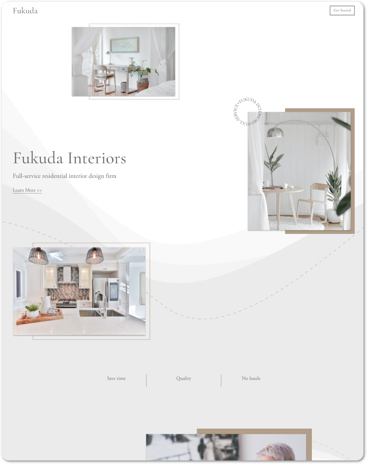
Interior design
Fukuda

About the project:
Fukuda is a concept created to demonstrate my ability to design sleek, stylish, and modern websites for interior design companies that want to reflect their creativity and professionalism online..
Homepage design:
Designed and built a full website that captures Fukuda’s design ethos—elegant, functional, and aspirational. The homepage immediately establishes the brand’s personality supported by a call-to-action.
The site structure includes dedicated pages for Home, About, Services, Individual Projects, Portfolio, Contact, and Blog—each carefully designed to balance visual impact with clarity. High-quality imagery and a minimal layout highlight the company’s work, while service details, testimonials, and a streamlined contact form guide users naturally toward reaching out.
Key improvements:
Sleek hero section with stylish typography and a clear CTA
Comprehensive page set (Home, About, Services, Projects, Portfolio, Blog, Contact) for a complete online presence
Portfolio and individual project pages designed to showcase work elegantly
Service pages with concise copy that highlight value and expertise
Fully responsive, modern design that ensures seamless browsing across devices
Result:
A modern, visually striking website concept that elevates Fukuda’s brand presence. The design blends sophistication with usability, providing potential clients with both inspiration and the confidence to connect.
Tailored designs | shared structure
Same custom Squarespace framework, adapted for a wedding photography business, UX app and a coworking space business


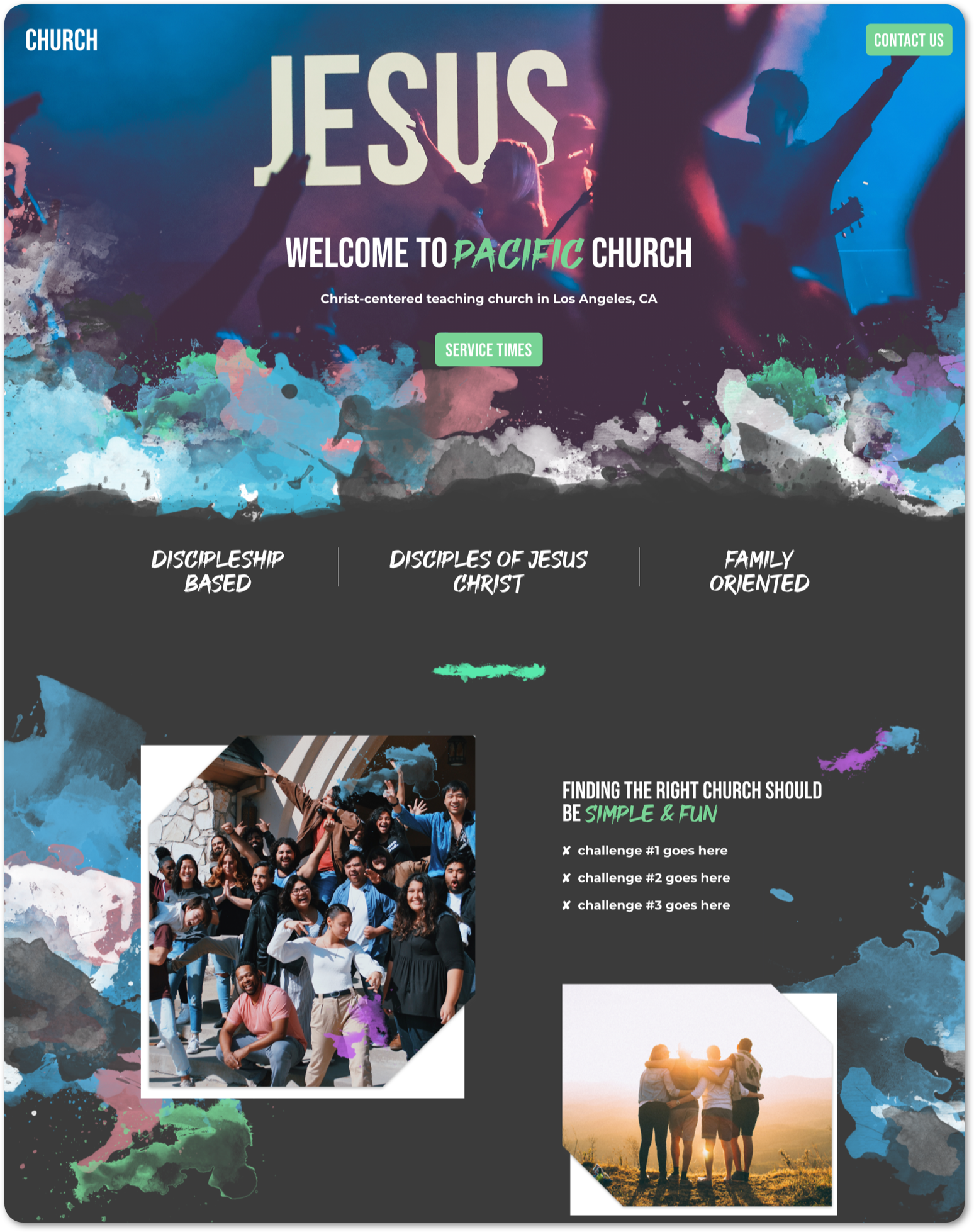
Nonprofit organization
Gateway

About the project:
The Gateway Children of LA is a concept created to demonstrate my ability to design mission-driven, emotionally engaging websites for cause-focused organizations.
Homepage design:
Designed and built a homepage that introduces the nonprofit’s mission, inspires action, and highlights its global impact. Crafted a clear, emotionally resonant message supported by impactful imagery and a clean content structure.
The homepage structure follows a clarity-focused messaging framework, guiding visitors through the nonprofit’s mission, the challenges it addresses, and clear pathways for engagement.
The visual design was enhanced with paint splatter effects, adding a creative, hand-crafted feel that reflects the nonprofit’s grassroots, human-centered mission. These painterly elements give the site an expressive, authentic aesthetic while balancing professionalism with warmth.
Key improvements:
Engaging hero section with concise mission statement and prominent call-to-action
Strategic content layout that guides visitors toward key actions
Impactful photography that reflects the nonprofit’s values and purpose
Fully responsive design for seamless viewing on all devices
Result:
A professional, mission-focused homepage concept that conveys warmth, builds trust, and motivates visitors to get involved or donate — effectively demonstrating nonprofit web design skills.
Tailored designs | shared structure
Same custom Squarespace framework, adapted for a church and daycare

Creative agency
Skyline Dark

About the project:
Skyline Dark is a concept created to demonstrate my ability to design bold, modern, and professional websites for creative agencies that want to stand out and communicate their value clearly.
Website design:
Designed and built a complete website that reflects Skyline Dark’s creative edge and professional identity.
The site includes dedicated pages for Home, About, Services, Individual Projects, Project Showcase, Blog, and Contact. Each page is designed to highlight the agency’s strengths. Services are presented with clarity, projects are showcased with strong visuals, and the blog provides a platform for thought leadership and insights. The layout balances bold design with usability, ensuring a smooth experience across the site.
Key improvements:
Impactful hero section with a confident headline and clear CTA
Comprehensive page structure covering About, Services, Projects, Blog, and Contact
Individual project pages designed to highlight case studies in detail
Services page with clear descriptions to communicate offerings effectively
Fully responsive design that adapts seamlessly across devices
Result:
A dynamic and professional website concept that positions Skyline Dark as a forward-thinking creative agency. The design captures attention, builds credibility, and guides potential clients to take action.

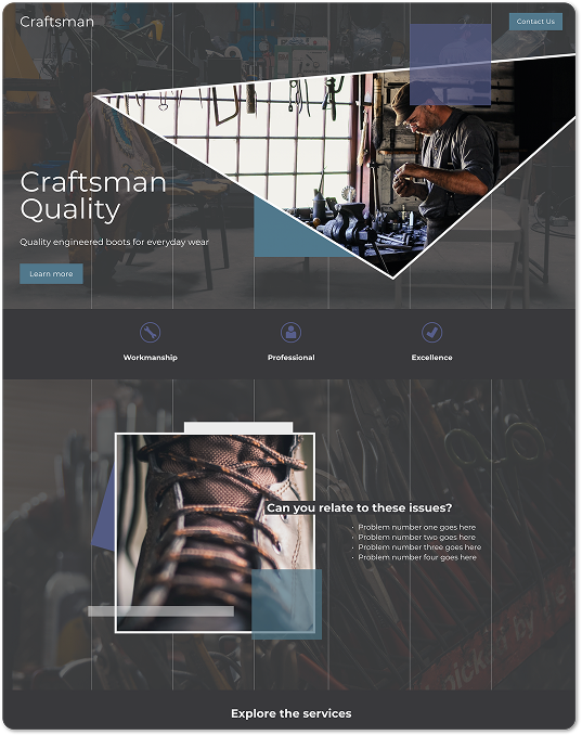
Footwear & apparel
Skyline light

About the project:
Skyline Light is a concept created to demonstrate my ability to design stylish, conversion-focused websites for footwear and apparel companies looking to showcase products and connect with customers online.
Website design:
Designed and built a full website that blends fashion-forward aesthetics with a user-friendly shopping experience.
The site includes dedicated pages for Home, About, Services, Individual Products, Product Showcase, Blog, and Contact. Each page balances clean visuals with practical functionality. Product and showcase pages highlight collections with strong imagery, while the About and Services sections build brand credibility. A simple contact page and blog provide ways for customers to engage further and stay connected.
Key improvements:
Stylish hero section with bold messaging and a direct CTA
Product and showcase pages designed to highlight collections effectively
About and Services pages that establish brand trust and credibility
Blog page for lifestyle content and customer engagement
Fully responsive design for a smooth shopping experience across devices
Result:
A sleek and modern website concept that positions Skyline Light as a dynamic footwear and apparel brand. The design communicates style and quality while providing customers with a seamless way to browse and take action.
Additional projects
-

Case study: Multi-platform brand
ALAN ROAMS TRAVEL BRAND
Developed a multi-platform travel brand centered on slow, purposeful travel, with a blog of guides, tips, and stories that complement YouTube, TikTok, and Instagram to inspire travelers through authentic experiences.
-
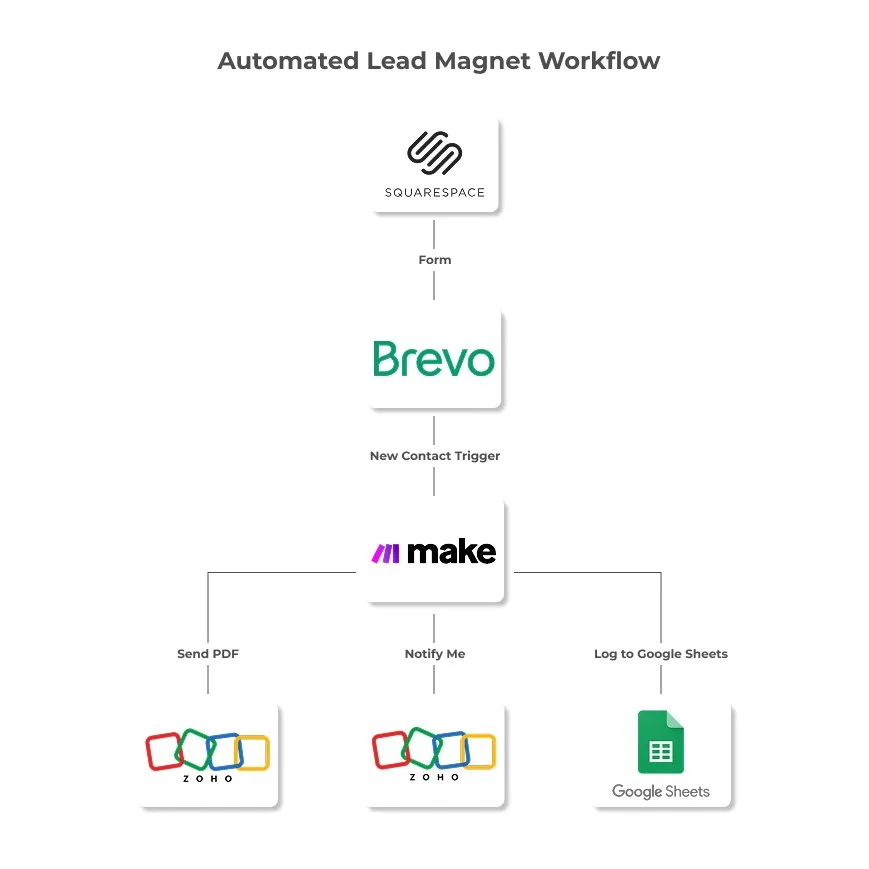
Case study: Automated workflow
LEAD MAGNET AUTOMATION SYSTEM
Automated workflow built with Squarespace, Brevo, Zoho Mail, and Make to collect subscribers, send branded PDFs, and log leads.
Seen enough? Let’s build yours.
Reach out and I’ll show you how your Squarespace site can look and feel premium without the agency markup.